This post details a technique that you can use in a dual orientation app to render more (or less) data in your tables–as space permits—using a couple of simple hooks. Keeping in mind that the last thing our app users want is to be unable to access the data they’re looking for, we’ll provide a hint showing how they can rotate their device to reveal even more.
Let’s begin with an example of how your app can look when you try to cram everything onto a small screen. This is the situation we’ll aim to avoid:
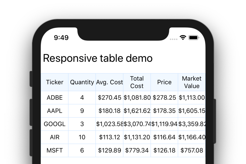
The first thing you’ll need is some tabular data in your app. For my sample app (code can be found here: blefebvre/react-native-responsive-table ), I have used the react-native-table-component package for rendering my table. This package provides a simple API and some handy extension points for styling various aspects of the table. The sample app includes six columns of data, representing securities in a stock portfolio:
// Table header items
const head = [
  "Ticker",
  "Quantity",
  "Avg. Cost",
  "Total Cost",
  "Price",
  "Market Value"
];

// Table data rows
const data = [
  ["ADBE", "4", "$270.45", "$1,081.80", "$278.25", "$1,113.00"],
  ["AAPL", "9", "$180.18", "$1,621.62", "$178.35", "$1,605.15"],
  ["GOOGL", "3", "$1,023.58", "$3,070.74", "$1,119.94", "$3,359.82"],
  ["AIR", "10", "$113.12", "$1,131.20", "$116.64", "$1,166.40"],
  ["MSFT", "6", "$129.89", "$779.34", "$126.18", "$757.08"]
];
Next, you’ll need to decide which columns of data you’d like to prioritize on small and medium screens. In my case, I chose to show “Ticker”, “Quantity”, and “Market Value” on small screens. On medium screens I chose to show everything except “Total Cost”. Put your selections into two arrays:
// Indices (columns) to include on a small screen
export const smallScreenIndices = [0, 1, 5];

// Indices to include on a medium screen
export const mediumScreenIndices = [0, 1, 2, 4, 5];
We will also need a function that can figure out which items should be included given a device breakpoint, and return the reduced set of data. Here’s an example of how this function could be implemented:
// Reduce arrays for display on smaller screens
// based on the provided breakpoint.
export function reduceDataForScreenSize(
  data: any[],
  breakpoint: Breakpoint,
  smallBreakpointIndices: number[],
  mediumBreakpointIndices: number[]
) {
  switch (breakpoint) {
    case Breakpoint.SMALL:
      // Return only data in the smallBreakpointIndices
      return data.filter((_, i) => smallBreakpointIndices.indexOf(i) !== -1);
    case Breakpoint.MEDIUM:
      // Return only data in the mediumBreakpointIndices
      return data.filter((_, i) => mediumBreakpointIndices.indexOf(i) !== -1);
    default:
      // Don't filter the data at all
      return data;
  }
}
A keen eye will have noticed the Breakpoint TypeScript type above. This parameter type is an enum, and is defined in useBreakpoint.ts as follows:
export enum Breakpoint {
  SMALL = "small",
  MEDIUM = "medium",
  LARGE = "large"
}
We will need a way to determine the breakpoint for use by the reduceDataForScreenSize(..) function. I wrote a small hook called useBreakpoint to return the current matching breakpoint:
// Determine if the current screen width should
// match the Small, Medium, or Large breakpoint.
export function useBreakpoint(): Breakpoint {
  const { width } = useScreenDimensions();
  console.log(`Determining device breakpoint for width: ${width}`);

  if (width < 500) {
    console.log(`= Breakpoint.SMALL`);
    return Breakpoint.SMALL;
  } else if (width >= 500 && width < 1000) {
    console.log(`= Breakpoint.MEDIUM`);
    return Breakpoint.MEDIUM;
  } else {
    console.log(`= Breakpoint.LARGE`);
    return Breakpoint.LARGE;
  }
}
useBreakpoint relies on another hook called useScreenDimensions to figure out the device’s screen size each time it changes:
// A hook to return the current screen dimensions
export function useScreenDimensions(): { width: number; height: number } {
  // Get initial dimensions and initialize state
  const initialDimensions = Dimensions.get("screen");
  const [width, setWidth] = useState(initialDimensions.width);
  const [height, setHeight] = useState(initialDimensions.height);

  useEffect(() => {
    const handleChange = ({ screen }: DimensionsCallbackProp) => {
      setWidth(screen.width);
      setHeight(screen.height);
    };

    // Listen for dimension changes, which typically indicates a rotation
    Dimensions.addEventListener("change", handleChange);

    // Cleanup
    return () => {
      Dimensions.removeEventListener("change", handleChange);
    };
  });

  return { width, height };
}
The two hooks compose together nicely, so all that needs to be done from our responsive table component is call const breakpoint = useBreakpoint(); and pass the result along to the reduceDataForScreenSize(..) function.
Here’s how this looks all put together (in StockTableResponsive.tsx):
// Component for displaying a table of stock data in a responsive manner.
export const StockTableResponsive: React.FunctionComponent<Props> = props => {
  // Get the current breakpoint from our hook
  const breakpoint = useBreakpoint();

  return (
    <>
      <Table borderStyle={styles.border} style={styles.table}>
        {/* Header row */}
        <Row
          data={reduceDataForScreenSize(
            head,
            breakpoint,
            smallScreenIndices,
            mediumScreenIndices
          )}
          style={styles.head}
          textStyle={styles.text}
        />

        {/* Data rows */}
        {data.map((entry, index) => (
          <Row
            key={index}
            data={reduceDataForScreenSize(
              entry,
              breakpoint,
              smallScreenIndices,
              mediumScreenIndices
            )}
            style={styles.dataRow}
            textStyle={styles.text}
          />
        ))}
      </Table>
      <RotationHint />
    </>
  );
};
Lastly, it is a good idea to tell the user that more detail can be revealed by rotating the screen. I have included a simple component above called <RotationHint /> which is going to do exactly this:
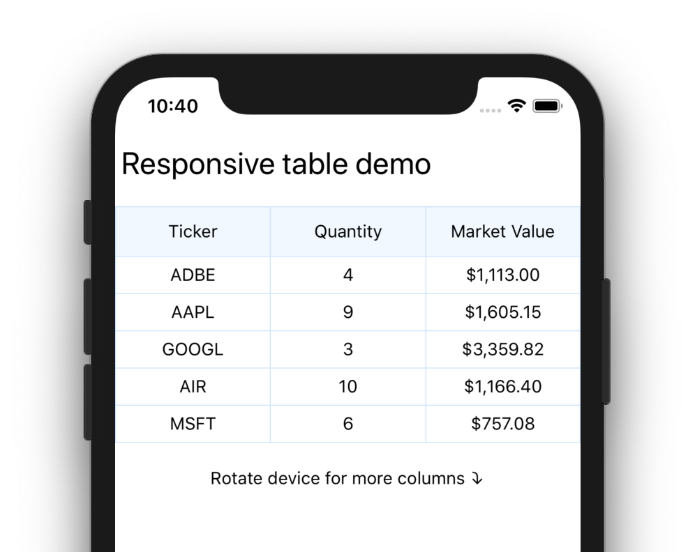
Once the device is rotated, the additional columns are instantly visible to the user:
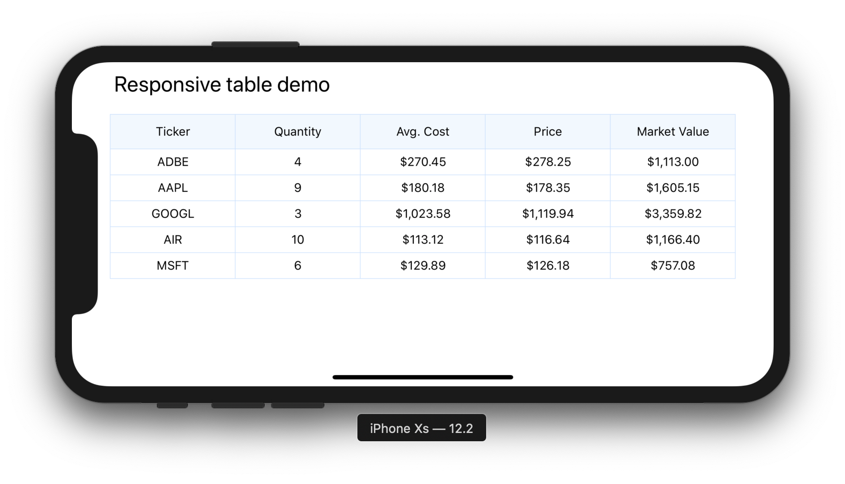
That’s it! You now have a table that looks great on mobile and supports showing additional data by rotating the device.
The demo app can be found on GitHub: github.com/blefebvre/react-native-responsive-table