Over the past month I’ve been working through an introductory Machine Learning course with Python. Being completely new to Python and finding the pace of the course quite high, I wanted to write up a post with a handful of tips and tricks I picked up before moving on to the next module in the program.
As a case study for this post, I put together a table of Canadian data to explore the relationships behind the GDP values of each of Canada’s provinces and territories. By the end of the post our goal is to come up with a model that will predict the GDP of a region given a set of key features.
If you have a Jupyter Notebook environment available you can download this post’s Notebook file on GitHub. 👈 Cool - Jupyter Notebooks render out to HTML on GitHub!
Sample data
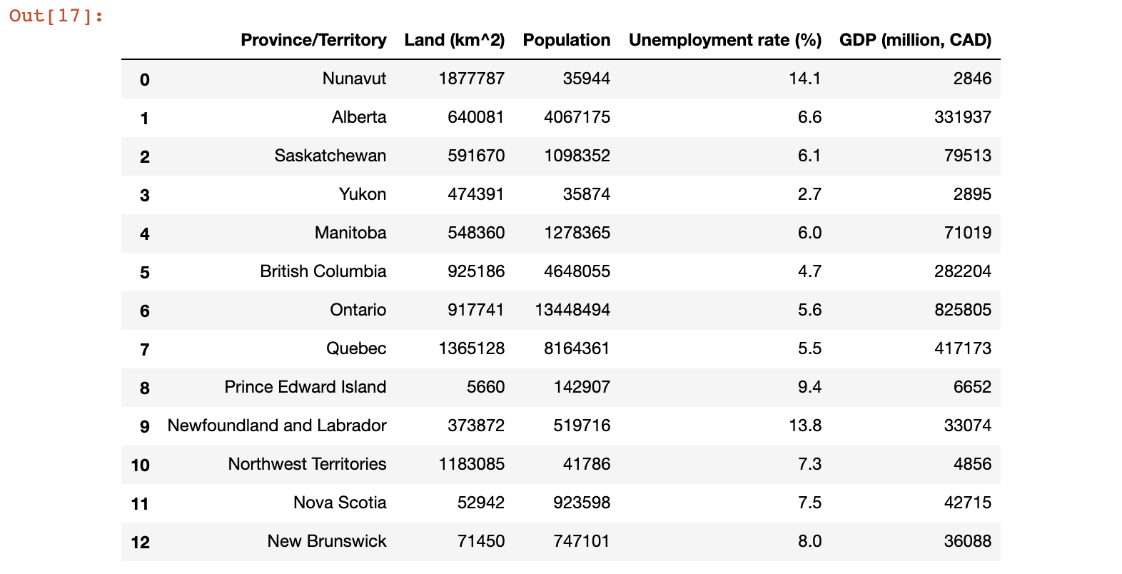
Here’s the initial dataset mentioned above, which includes the following features: Land (km^2), Population, Unemployment rate (%), as well as the target value GDP (million, CAD) (making this a Regression problem). Data has been collected primarily from articles on Wikipedia:
import numpy as np
import pandas as pd
from sklearn.model_selection import train_test_split

data = {
    'Province/Territory':
        ['Nunavut', 'Alberta', 'Saskatchewan',
        'Yukon', 'Manitoba', 'British Columbia',
        'Ontario', 'Quebec', 'Prince Edward Island',
        'Newfoundland and Labrador',
        'Northwest Territories', 'Nova Scotia',
        'New Brunswick'],
    'Land (km^2)':
        [1877787, 640081, 591670, 474391, 548360,
        925186, 917741, 1365128, 5660,
        373872, 1183085, 52942, 71450],
    'Population':
        [35944, 4067175, 1098352, 35874, 1278365,
        4648055, 13448494, 8164361, 142907,
        519716, 41786, 923598, 747101],
    'Unemployment rate (%)':
        [14.1, 6.6, 6.1, 2.7, 6, 4.7, 5.6, 5.5,
        9.4, 13.8, 7.3, 7.5, 8],
    'GDP (million, CAD)':
        [2846, 331937, 79513, 2895, 71019,
        282204, 825805, 417173, 6652,
        33074, 4856, 42715, 36088]
}

# Instantiate a new DataFrame with the above dict
canada_df = pd.DataFrame(data)

# Pick the columns we want from the original dict, and indicate the desired order.
# This is necessary for versions of Python before 3.6, which did not maintain an order in the dict type.
canada_df = canada_df[['Province/Territory', 'Land (km^2)', 'Population', 'Unemployment rate (%)', 'GDP (million, CAD)']]

print(canada_df)
If all goes well when the above code is run, it should render a table similar to:
We’ll use this dataset as the subject of our investigation for the remainder of this post.
Examining data
Most real world datasets will not be able to fit completely on your laptop monitor, so it will be necessary to examine their data programmatically. Looking at our data and searching for factors that may lead to a higher GDP, let’s begin by counting the number of provinces with “high” unemployment vs. “low”, where a province is classified as “high” if it’s % unemployment is > 7% (an arbitrary number that I picked):
high_unemployment_series = canada_df['Unemployment rate (%)'] > 7

high_unemployment_count = len(high_unemployment_series[high_unemployment_series == True].index)
low_unemployment_count = len(high_unemployment_series[high_unemployment_series == False].index)

print("High unemployment: ", high_unemployment_count) # 6
print("Low unemployment: ", low_unemployment_count)   # 7
Reshaping Numpy arrays
I kept running into functions which required their params to be 2d arrays, and found myself often converting a 1d array to 2d for processing. Here is how that can be done easily with Numpy:
# Extract GDP as a numpy array
gdp_values = canada_df['GDP (million, CAD)'].values

print("GDP values:", gdp_values)

# Now convert to a 2d array with reshape.
# .reshape: "One shape dimension can be -1. In this case, the value is inferred from the length of the array
# and remaining dimensions"
gdp_values_2d = gdp_values.reshape(-1, 1)

print("GDP values, 2d:", gdp_values_2d) # [[  2846], [331937], [ 79513], ...]
Classifying samples by their features
To further investigate this data, let’s generate an additional feature based on the total GDP for the region. We’ll make it a numeric value from 1 to 3, where a class of 1 indicates a relatively small GDP, 2 for medium, and 3 for large.
We can generate this feature by calling apply on the DataFrame, and passing in a function to execute on each sample of the data. By passing axis=1, the function will be applied to each row, and the value returned from the function will be included as a new feature.
Here’s how generating a GDP size class could be implemented for our problem:
# First, assign a class based on GDP (small: 1, medium: 2, large: 3) to enable visual differentiation
# between the difference sizes of GDP
def classify_gdp(row):
    gdp = row['GDP (million, CAD)']
    if gdp < 10000:
        val = 1
    elif gdp >= 10000 and gdp < 100000:
        val = 2
    else:
        val = 3
    return val

canada_df['GDP size label'] = canada_df.apply(classify_gdp, axis=1)
canada_df
Looking for features that will be good at predicting GDP
Now that we have our samples classified as small, medium, or large, we can use the pandas.plotting.scatter_matrix function to plot a matrix of scatter plots with each set of features paired up. The samples in each plot will be color coded so we can see at a glance which features are correlated to a high GDP, and how they are grouped. Here’s how this code will look for our dataset:
from matplotlib import cm
%matplotlib notebook

# First, separate training from test data
# Select only numeric features that we're interested in plotting.
# Inlcuding 'GDP (million, CAD)' wouldn't make sense here, since it would leak data about the target!
X = canada_df[['Land (km^2)', 'Population', 'Unemployment rate (%)']]

# This column of labels will be our target y values
y = canada_df['GDP size label']
X_train, X_test, y_train, y_test = train_test_split(X, y, random_state=0)

# Plot the training values!
cmap = cm.get_cmap('gnuplot')
scatter = pd.plotting.scatter_matrix(X_train, c = y_train, marker = 'o', s = 40, hist_kwds = {'bins':15}, figsize = (9,9), cmap = cmap)
Here’s how the resulting matrix looks:
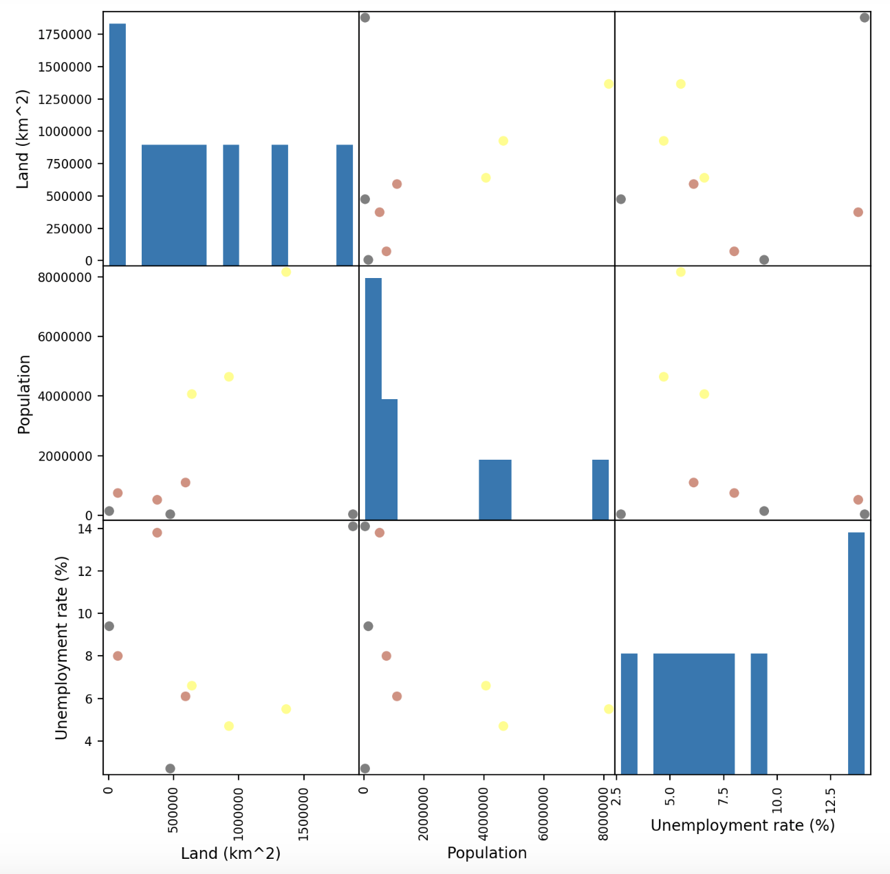
What can we learn from this matrix? Well, it appears that some feature combinations like Land and Population lead to similar coloured points on the plots being grouped together. These are features which could be useful for predicting GDP with. On the other hand, the plots involving Unemployment don’t seem particularly well grouped, which might indicate that this feature is less significant to a region’s GDP.
Comparing models for Regression
Let’s make some predictions! The goal of the exercise below is to pick the best model for predicting the GDP of a previously unseen province or territory. The splitting of the data will therefor look as follows, with y values being continuous (as opposed to using the “GDP size label” classification we defined above):
y_regression = canada_df['GDP (million, CAD)']
X_train, X_test, y_train, y_test = train_test_split(X, y_regression, random_state=1)
We covered a variety of learning models in the first month of the course I’m taking. The approach of choosing the correct model for the task at hand is still black magic to me, so I decided to evaluate a few different approaches and “score” them on how well they generalize to the test data that was split above.
The section titled “Comparing models for Regression” in the notebook (sorry, can’t seem to deep link into the Notebook file) contains the code covering the use of the five below approaches as well as the R-squared score (aka the coefficient of determination) of each on the training and test sets:
- Linear regression
- Ridge regression
- Ridge regression with normalization
- Polynomial regression
- Decision Tree regression
Since the model’s fit() step and the scoring are similar for each approach I won’t repeat the code here, but encourage you to check out the notebook if you’d like to see how each approach performed.
Which performed best? In this case, the Ridge regression with normalization model performed the best, predicting GDP with an R-squared score of 0.954 on the test data.
NOTE! This is a contrived example, and is extremely light on the number of samples. There is nothing at all wrong with the models that performed poorly on this dataset.
Decision tree regression
Let’s take a closer look at the decision tree regression model. This model is interesting because it ranks the importance of the features in determining the result:
import operator
decision_tree = DecisionTreeRegressor(random_state=0, max_depth=3).fit(X_train, y_train)

print('Decision Tree Regressor R^2 score (training): {:.3f}'
     .format(decision_tree.score(X_train, y_train)))
print('Decision Tree Regressor R^2 score (test): {:.3f}'
     .format(decision_tree.score(X_test, y_test)))

# Find the "most important" features from the tree's perspective
importance_dict = dict(zip(X_train.columns, decision_tree.feature_importances_))
# SORT DICTIONARY by value into a list of tuples:
sorted_importance = sorted(importance_dict.items(), key=operator.itemgetter(1), reverse=True)

print("Important features:", sorted_importance)
The last print statement above yields the following:
Important features: [
    ('Population', 0.9868237285875826),
    ('Land (km^2)', 0.013176271412417347),
    ('Unemployment rate (%)', 0.0)
]
👆 based on this ranking, and from the perspective of building an effective decision tree, Population is the most important feature by an overwhelming margin. Which makes sense intuitively: the more people, the higher the GDP.
Additionally, as we suspected by looking at the scatter matrix above, unemployment rate does not seem to factor in much at all.
Joining DataFrames on a common column
Lastly, I’d like to highlight a handy method I used to merge (or join in SQL terms) two dataframes together on a common column.
Let’s say there was additional data which we wanted to include as part of our model, but it did not exist in the .csv file from which we read the rest of the data. With the pandas.merge method, two DataFrames can be merged together with very little fuss. Here’s an example of merging in another DataFrame which includes details on the amount of water in each region:
# Note how the data is in a different order than that of the canada_df.
water_data = {
    'Province/Territory':
        ['Ontario', 'Quebec', 'Nova Scotia', 'Manitoba', 'New Brunswick',
         'British Columbia', 'Prince Edward Island', 'Saskatchewan', 'Alberta',
         'Newfoundland and Labrador', 'Northwest Territories', 'Yukon', 'Nunavut'
        ],
    'Water (km^2)':
        [158654, 185928, 1946, 94241, 1458, 19549, 0, 59366, 19531, 31340,
         163021, 8052, 157077
        ]
}

# Instantiate a new DataFrame with the above dict
water_df = pd.DataFrame(water_data)

# Join water_df with canada_df, on the 'Province/Territory' column, use a left join
merged_df = pd.merge(left=canada_df, right=water_df, how='left', left_on='Province/Territory', right_on='Province/Territory')
merged_df
To note from the above, how='left' tells the merge to operate similar to an SQL left outer join: all keys from the left frame will be included in the resulting DataFrame, but keys in the right frame without a match on the left will be excluded.
Conclusion
This has been a great course so far and I am learning a ton. If you would like to check it out for yourself, click here: coursera.org/learn/python-machine-learning
Next up: Neural Networks! 🤓